Audience Workflow Improvements
Role: Lead Product Designer
Platform: Desktop Web App
Duration: June - September, 2022
Tools: Figma
Team: 2 developers, a product manager, a QA engineer, and an application architect.
Deliverables:
- Competitive analysis
- Data analysis
- User interviews
- Personas
- User flows
- Sketches, low-fidelity wireframes & rapid prototypes
- High-fidelity mockups & prototypes
- Usability tests and findings
About illumin™
illumin™ DSP is a journey automation advertising technology that allows advertisers to see the entire process to plan and activate omnichannel campaigns and see results on the same platform.
Users come to the Audience Library page to add, create, manage and analyze their audiences. The audience list contains the user's first-party segments, third-party segments that they choose to add, and any custom audiences that they create.
The Journey Canvas page is where users set up their campaigns by adding conditions and creatives, and target audiences that were added or created in the Audience Library page.
Problem
Through user feedback from online surveys and user interviews, analysis of customer support tickets, and by tracking and analyzing the usage patterns and behaviour of users in the platform, we discovered that configuring audiences was complex and confusing. Users were unable to create or modify audiences directly on the Journey Canvas page and had to take multiple steps to navigate to the audience builder tool.
A 15 minutes or longer processing delay was occurring when users created Dynamic audiences. While this process was running in the background and users could initiate other tasks within the system, their workflow was interrupted. Users had to return to complete the Dynamic audience set once the suggestions were generated.
Project Goal
Improve the discovery of audiences and provide an easy and intuitive experience to browse, add, create and manage audiences in the Journey Canvas and the Audience Library page to reduce the time it takes to set up campaigns.
Key Solutions
Some examples of the problems we addressed and the proposed design solutions that contributed to delivering a better experience.
Before
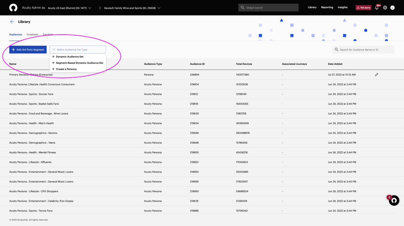
The naming of the audience types is not reflecting industry terminology and creates confusion. Persona and Dynamic audiences are categorized as “Combined” audiences on other DSP platforms.
After
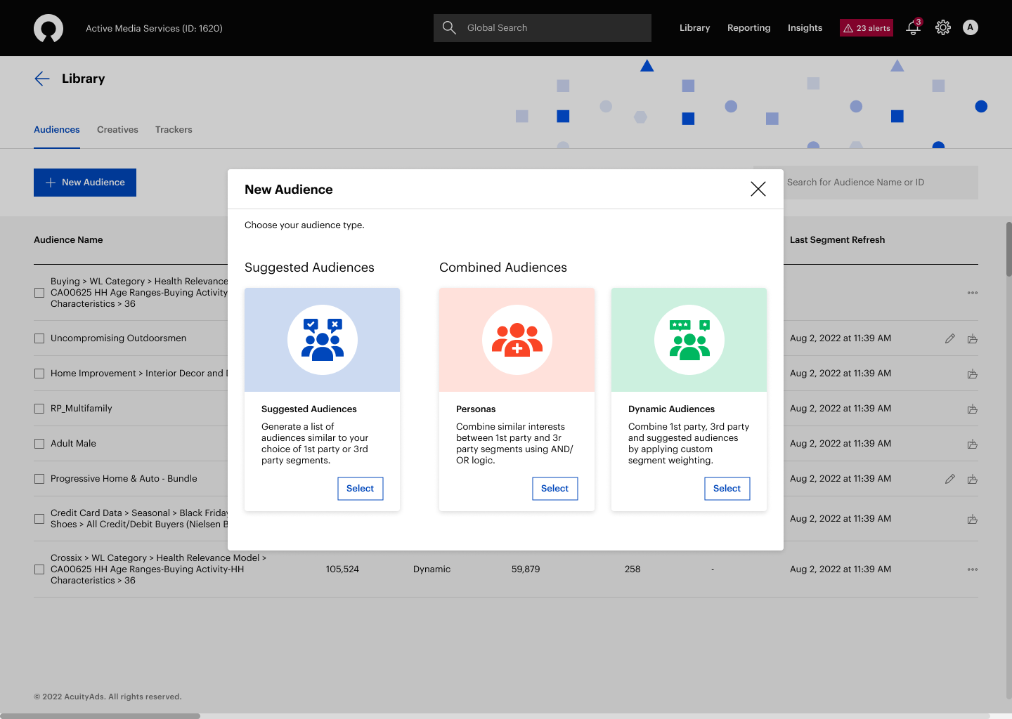
The audience types are categorized as “Suggested Audiences” and “Combined Audiences”. A brief audience-type description was provided to help users make informed choices.
“Add 3rd Party Segments” and “Select Audience Set Type” buttons were combined into a single “New Audience” button to declutter the interface and to provide quick access to all audience types.
The 3rd party audience type was removed to streamline the audience configuration process and to remove redundant functionality.
Before
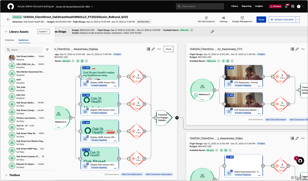
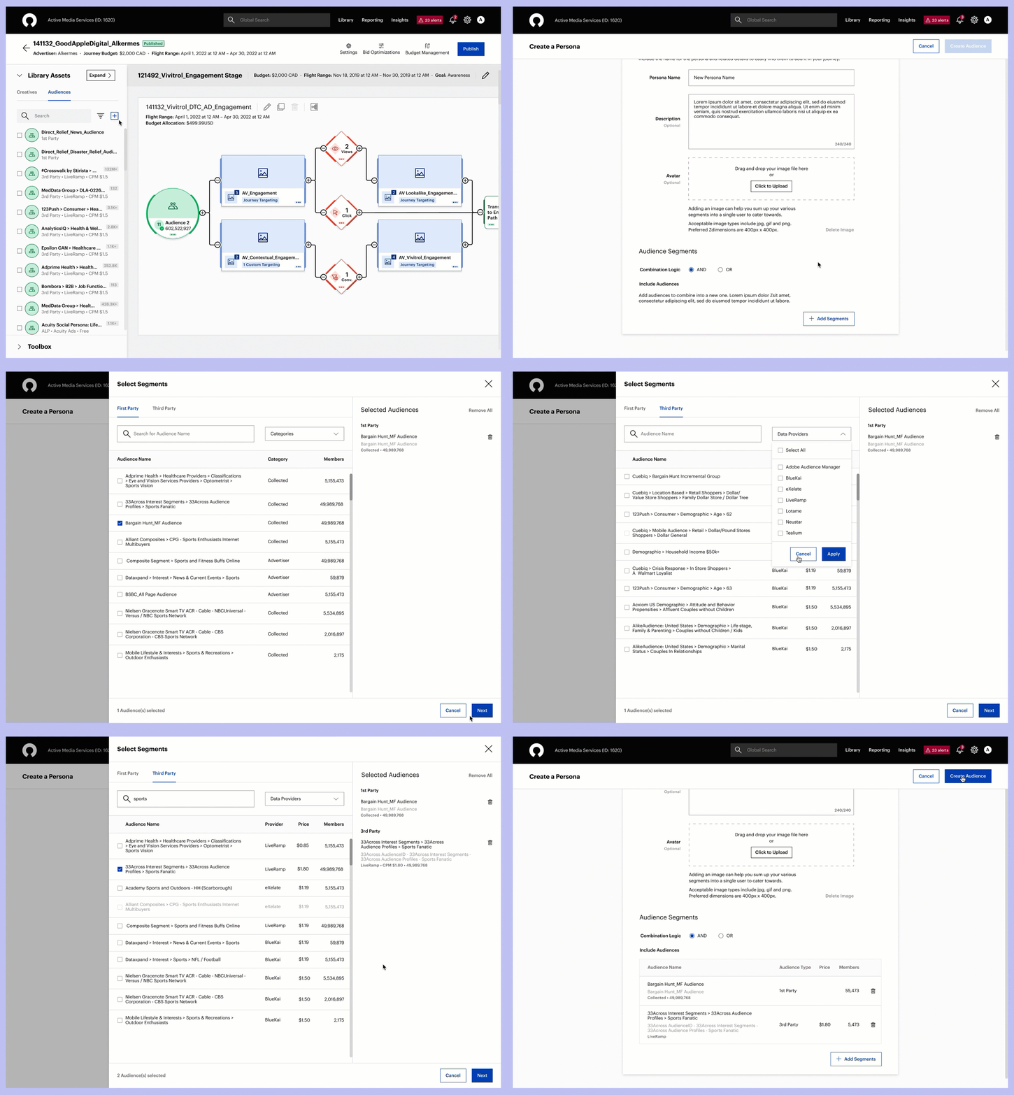
As users spent most of their time setting up and optimizing campaigns on the Journey Canvas page, they had no ability to create, add or modify audiences directly on this page. Users had to take multiple steps and move through a series of pages in the platform to navigate to the audience builder page.
After
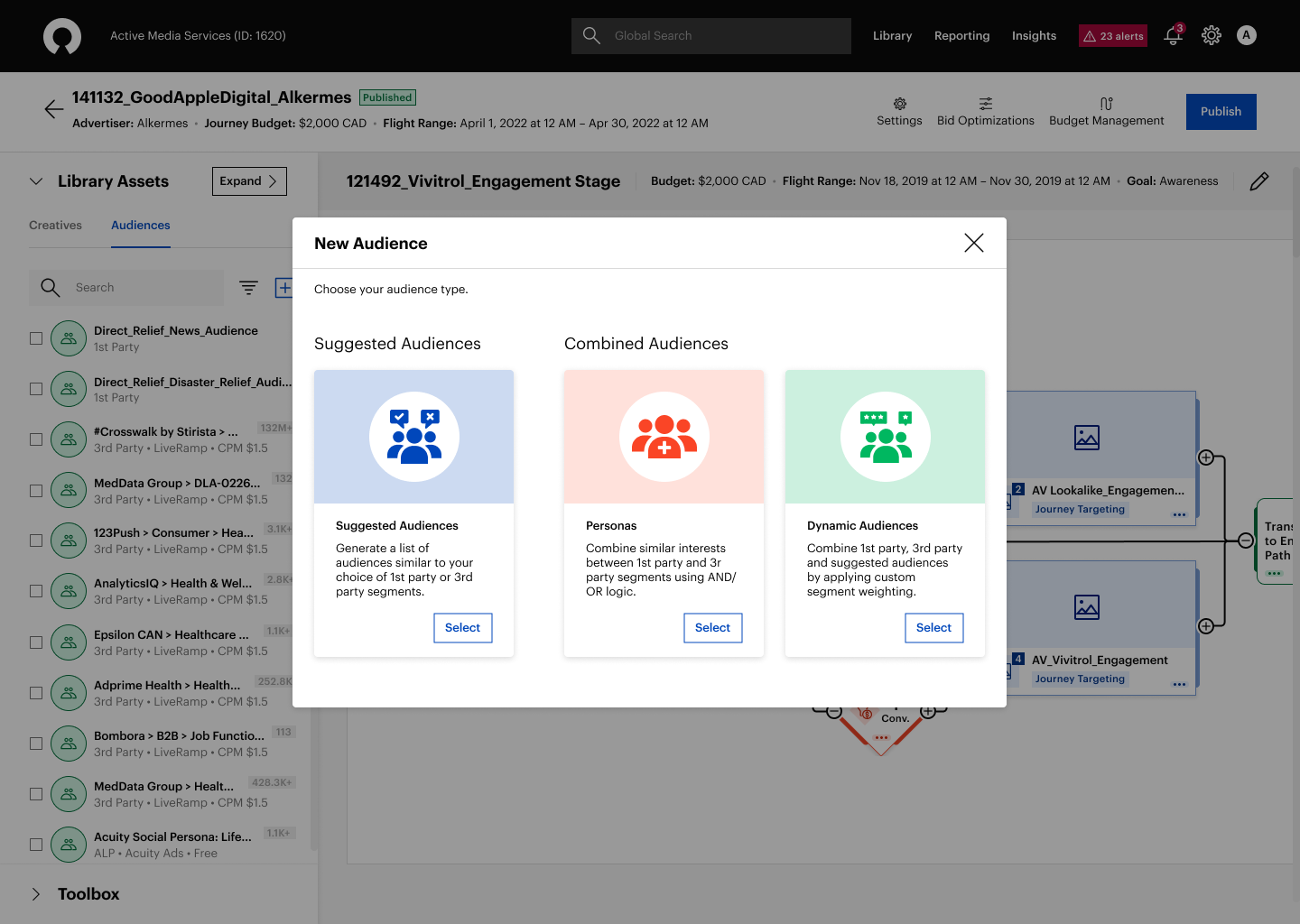
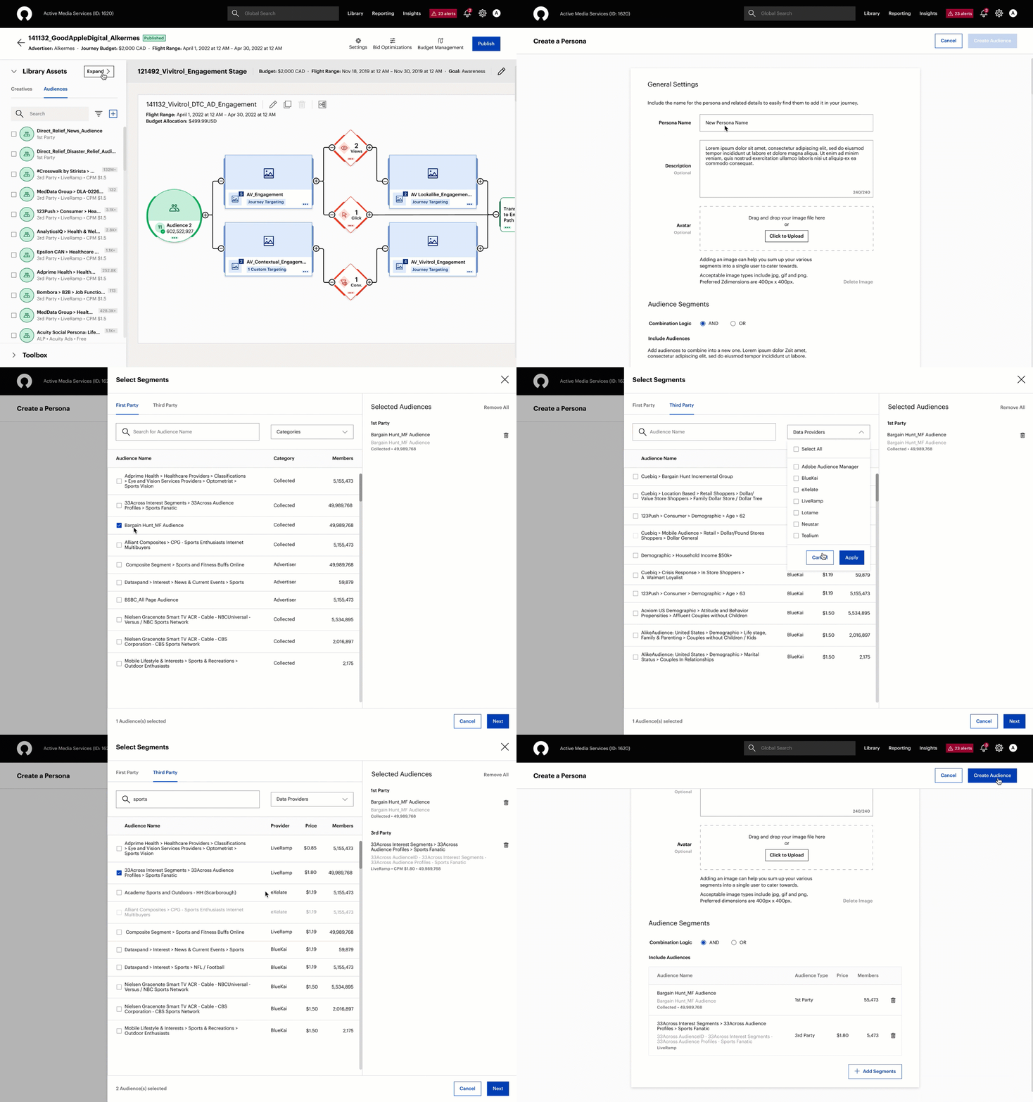
We provided a seamless and consistent user experience to browse, add, create and manage audiences on the Journey Canvas page by reducing the time it takes to set up campaigns on the platform.
Before
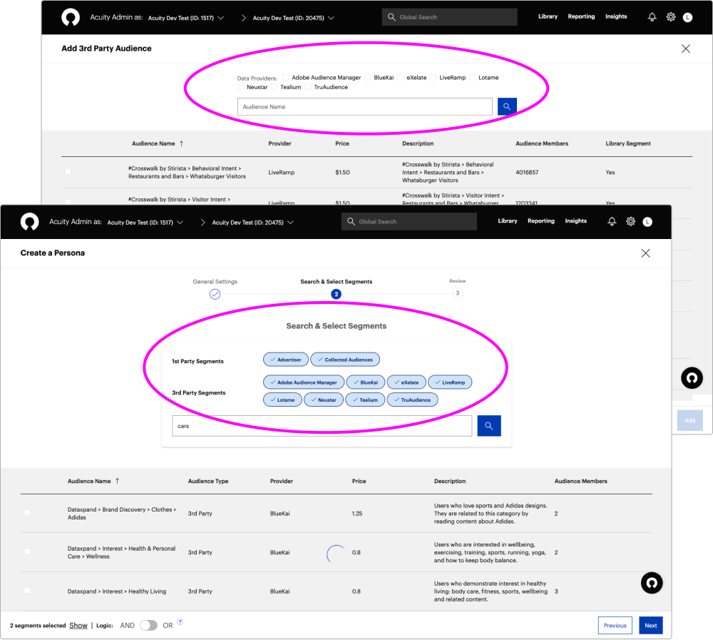
Inconsistent UI for filtering 1st party and 3rd party data on different audience creation pages.
After
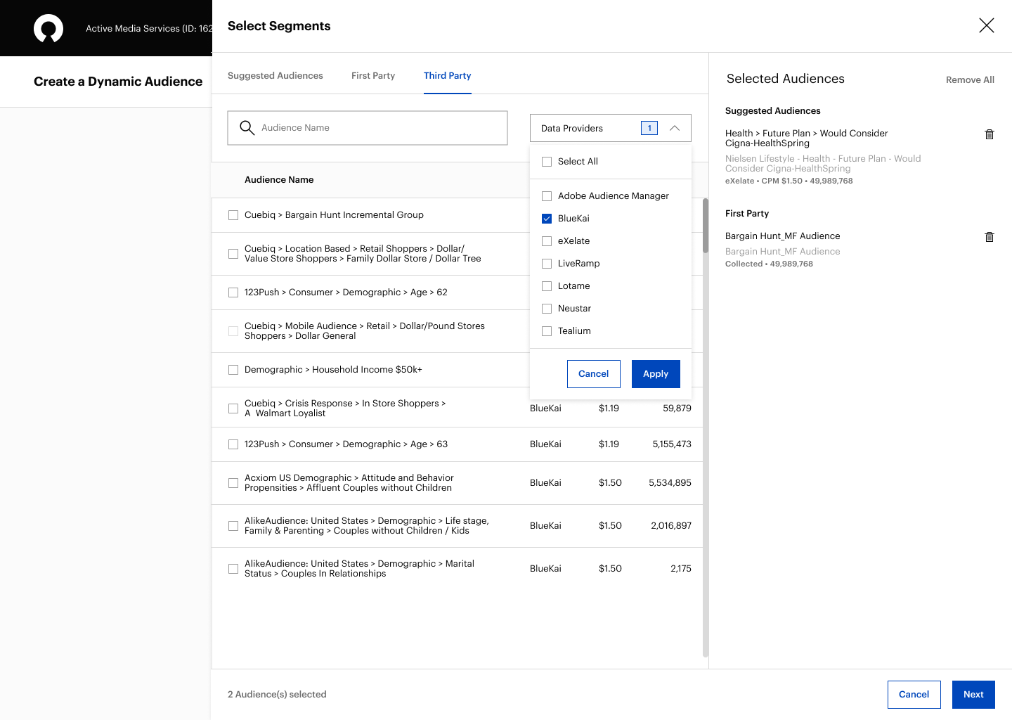
The pill and checkbox components were replaced with a dropdown to provide a consistent UI for filtering data by Providers or Categories and to help declutter the interface.
Before
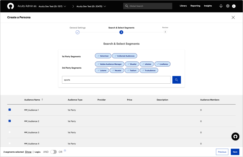
Unable to identify selected segment details insight without opening the audience drawer or selecting other tabs to find out which segments were previously added.
After
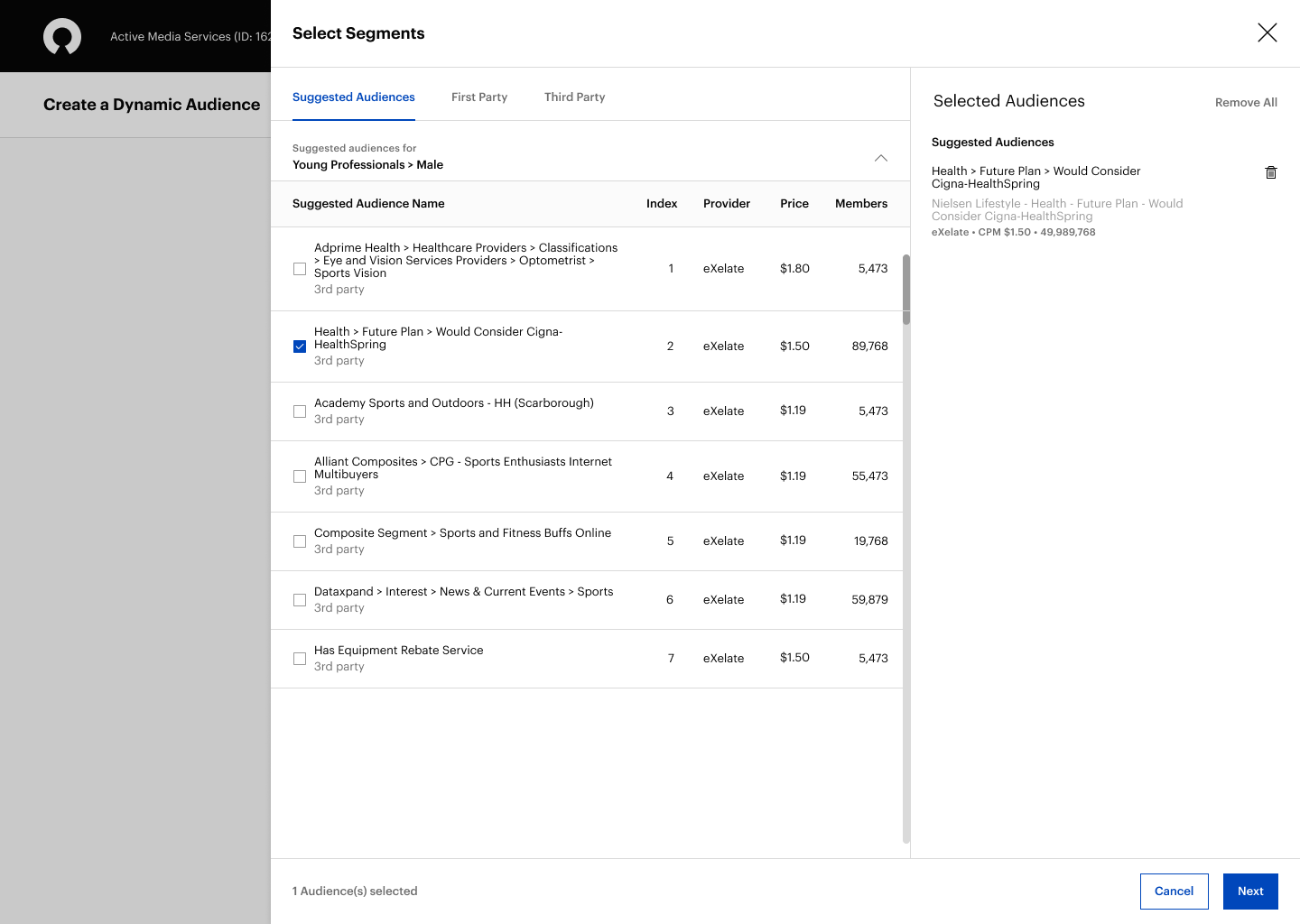
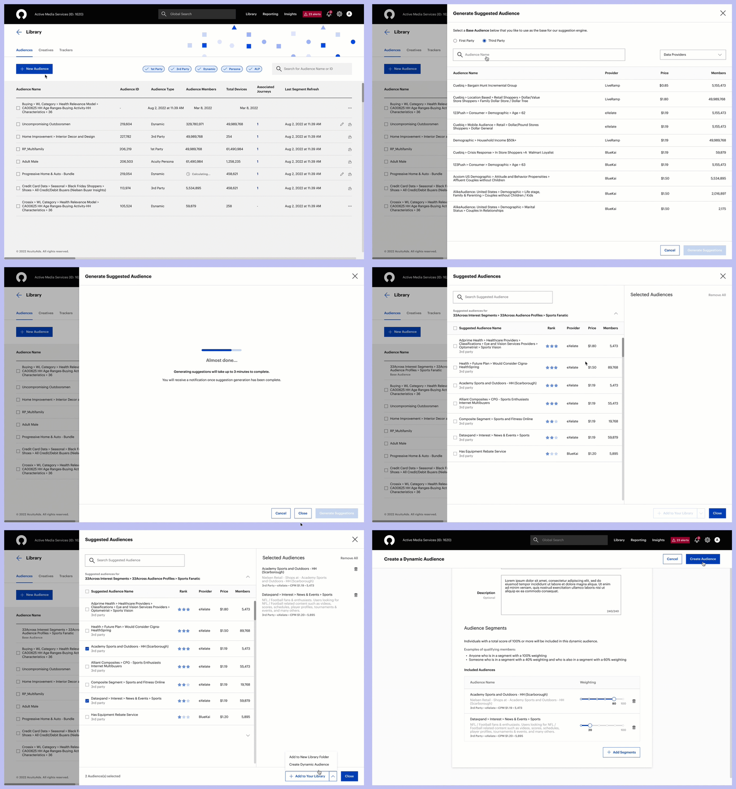
The right side panel provides users with a persistent view of their selected segments during audience creation along with segment description, data provider, cost and segment size.
Before
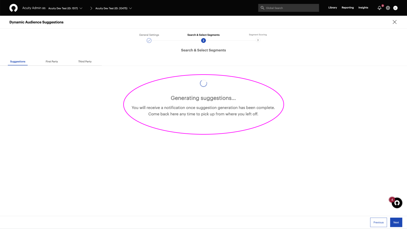
No clear indication of the process completed and time remaining for generating suggestions.
After
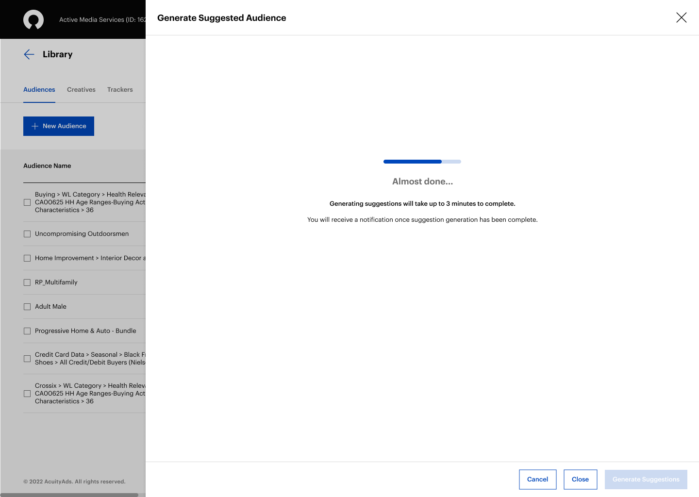
An indeterminate progress bar and the message "Generating suggestions will take up to 3 minutes to complete" give users an estimate of how long they have to wait for the process to complete, makes the wait more tolerable and increases user confidence.
Before
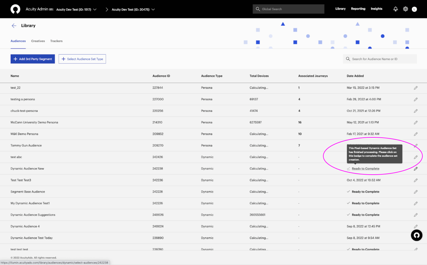
Users had to click on the "Ready to Complete" badge to return and complete the Dynamic audience set creation once they received an email notification that suggestions were completed.
After
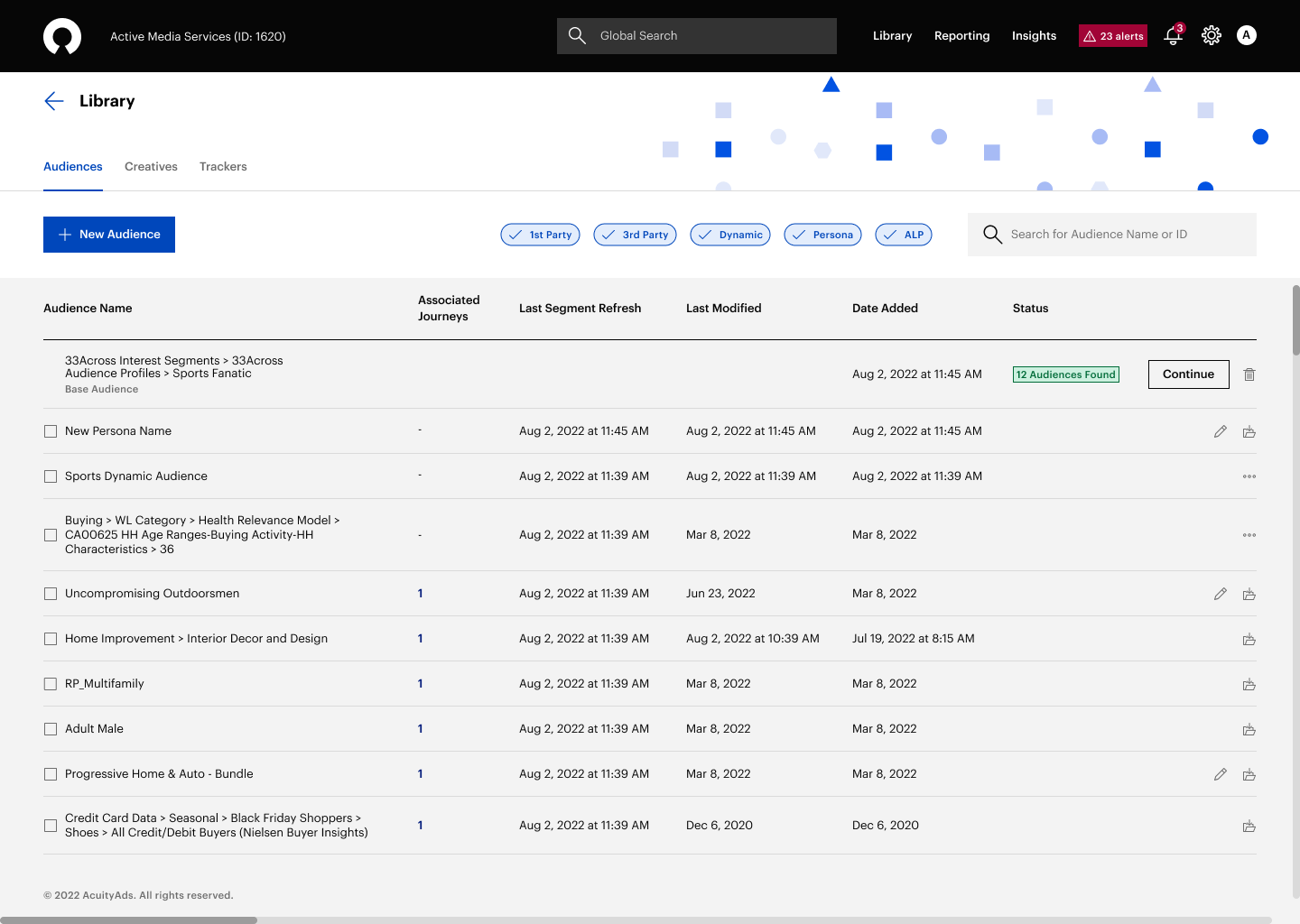
The Dynamic audience creation workflow was simplified, and users are no longer required to return and complete the initiated Dynamic audience set, resulting in a better user experience.
Before
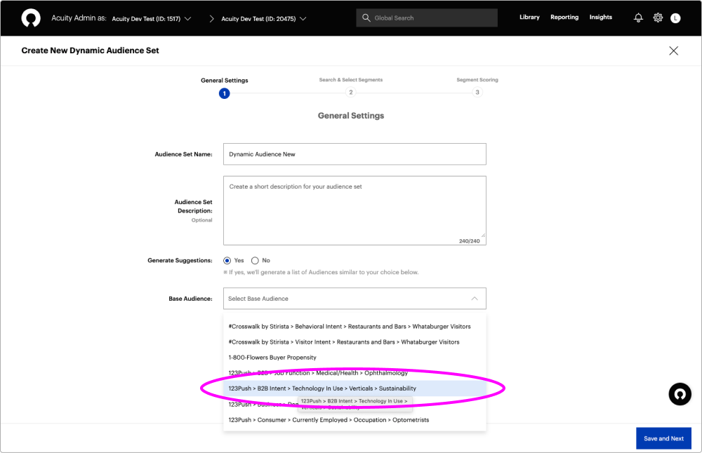
Unable to identify which base audience list items are 1st party or 3rd party data for generating suggestions.
After
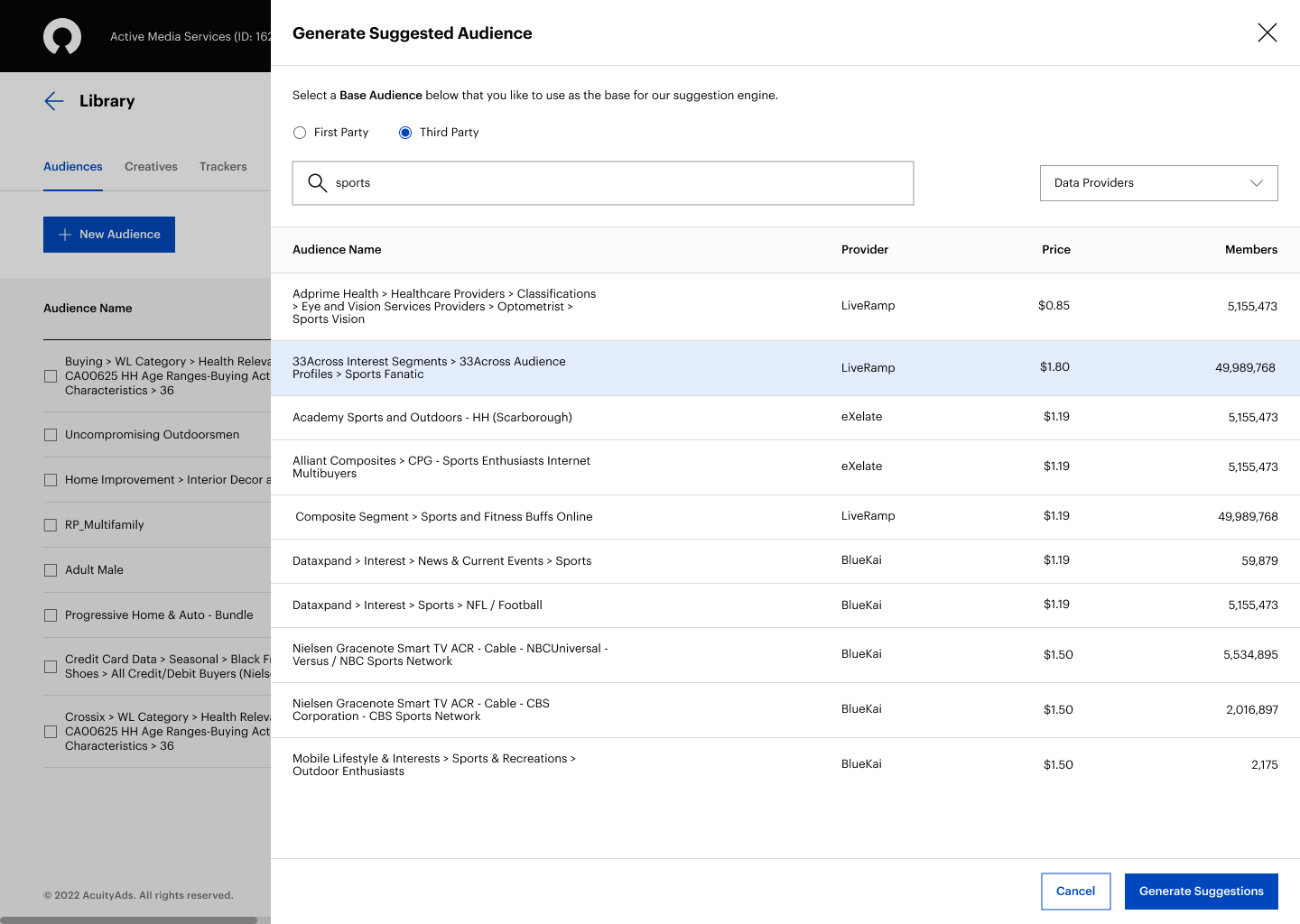
Users can quickly select the segment type they want to use as the base for the suggestion engine via two radio buttons labelled “First Party” and “Third Party.”
Before
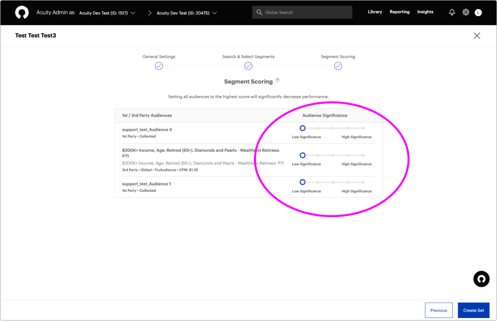
Users found it difficult to understand the current UI of the dynamic segment scoring without a percentile or weighting functionality, as it doesn't match the ALA builder tool.
After
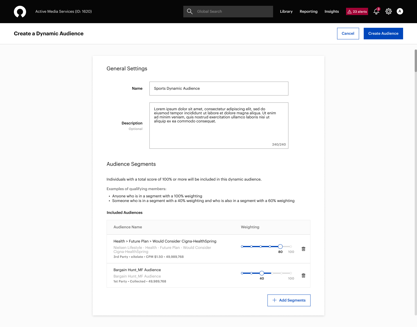
Users can apply segment weighting with a percentile functionality to influence the weight assigned to each selected segment to prioritize who will be included in their audience.
Research
User Interviews
The platform supports our internal Ad Ops team of Campaign Managers that are programmatic experts with specialized skills that plan, coordinate, implement and oversee marketing campaigns for different advertisers and agencies.
To better understand their process when creating audiences, I interviewed six Campaign Managers and I discovered multiple product and design limitations.
Findings
- Unable to view detailed insight of selected segments when building combined audiences, and having to open the audience drawer or select other tabs to find out which segments were previously added.
- Unable to build and manage audiences directly on the Journey Canvas page and having to navigate to the audience builder to create or modify audiences.
- The naming of the audience types is not reflecting industry terminology.
- Navigating through a wizard to create audiences, makes it inconvenient to quickly correct mistakes and backtrack on choices made for audiences built.
- Waiting a long time for the system to generate suggested audiences and having to return to complete the Dynamic audience set.
- Inconsistent UI for filtering 1st party and 3rd party data on different audience creation pages.
- Difficult to understand the current dynamic segment scoring without a percentile or weighting functionality.
- Unable to identify which base audience list items are 1st party or 3rd party data for generating suggestions.
Data Insights
We used Pendo to track and analyze the usage patterns and user behaviour on the Audience Library and the Journey Canvas pages.
Personas
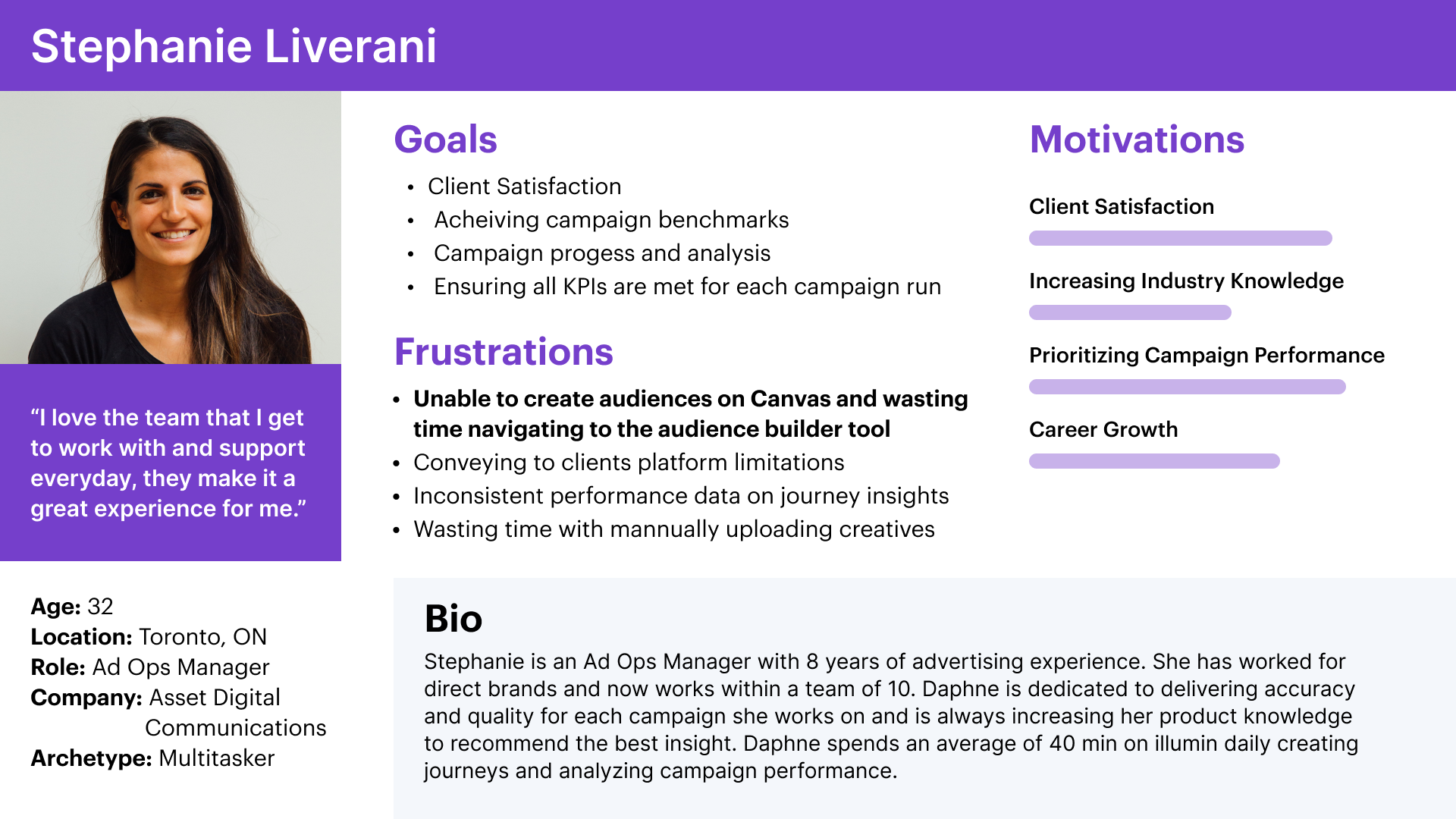
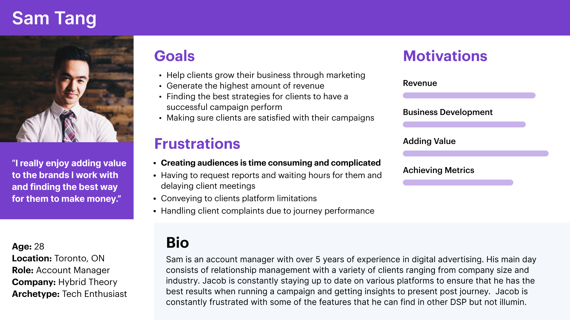
Given our research findings and based on the identified user pain points, I created personas that captured the essence of our users, their goals, motivations, and habits.
Engineering Meeting
Key Takeaways
Due to the complexity of the underlying technology of the platform, we worked closely with the Engineering team from the beginning to discuss any technical challenges, align the team on priorities and highlight areas of concern, such as the long wait that was occurring when users generated suggestions, and how it affected them.
- Bug fixes to support the search and browse functionality for 3rd party audiences from a list of data providers.
- De-scope high-effort requirements
- Look-back window can only be added for 1st party audiences.
User Flows
Based on the requirements document and the research findings, I outlined the critical parts for a successful user experience, I articulated the user needs and goals in the form of user stories, and I created user flows to evaluate how users navigate and interact with the platform, and the steps required to complete different tasks.
Ideation
Design Concept Sketches
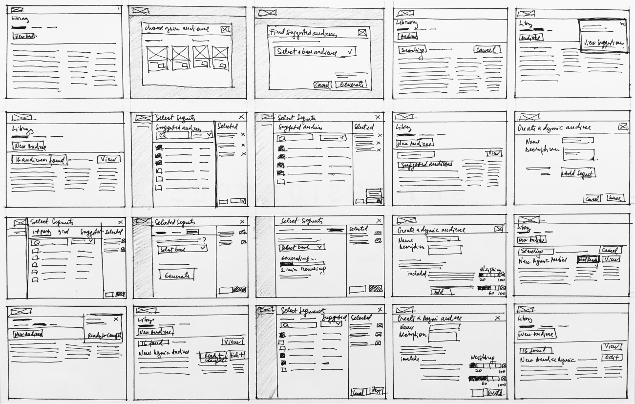
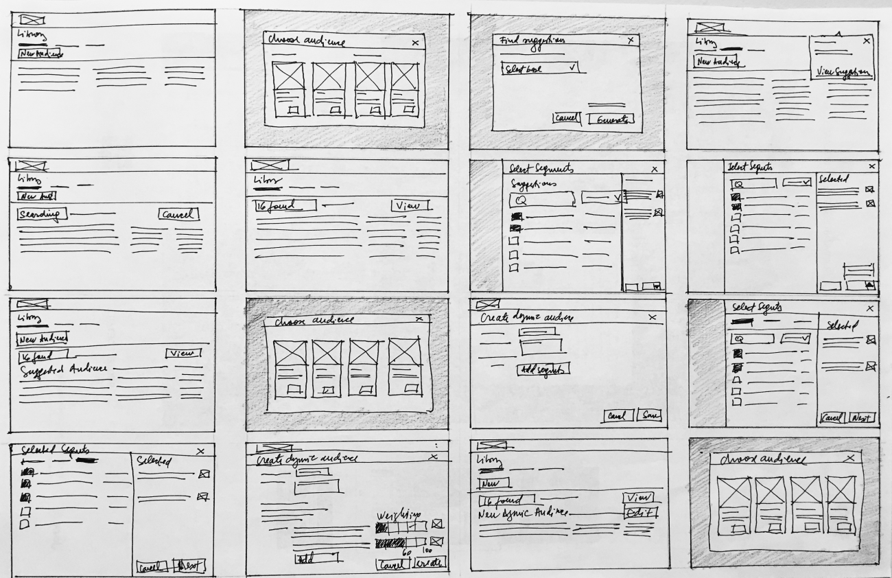
I defined key tasks for the Audience Library page and I created sketches to explore different design concepts to tackle the problem space.
Design Idea 1
With one design concept, we explored the idea of providing the flexibility of generating suggestions in advance, as a separate audience type, in addition to the existing functionality within the Dynamic audience creation process.
Design Idea 2
With the second design concept, in addition to having suggested audiences as a new audience type, the functionality to generate suggestions within Dynamic audiences was removed completely. With this design approach, Dynamic audiences were configured by combining only ready, pre-generated suggested audiences. The processing delay and workflow interruption were eliminated. The flow was simplified.
I reviewed the two design concepts within the Product team and I conducted peer design review sessions to evaluate the designs, share the vision within the team, gain alignment and drive decision-making.
My team’s feedback was that the first concept was too complicated and we ended up choosing to move forward with the second design concept.
Audience Library Page
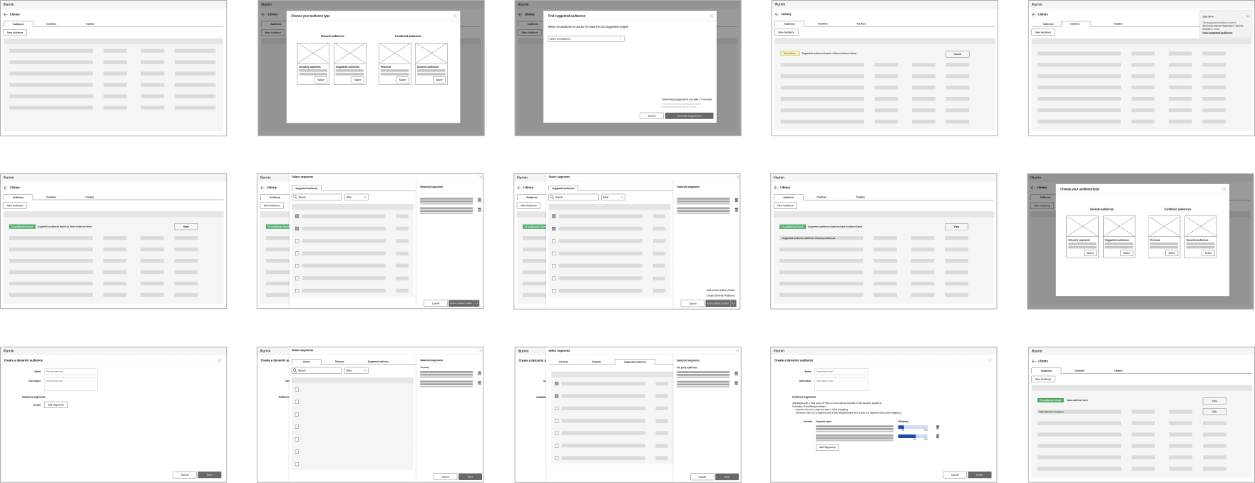
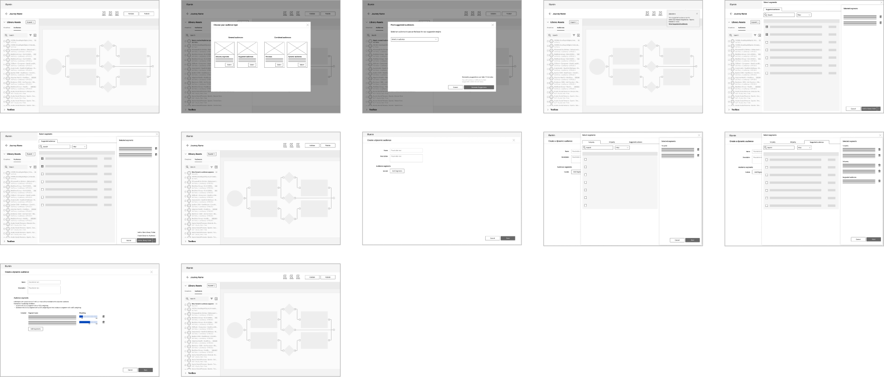
Next, I created low-fidelity wireframes for the Audience Library page thinking of the structure, layout, and design hierarchy and using existing components to increase consistency and reduce development costs.
Journey Canvas Page
As the functionality to create or modify audiences was not available on the Journey Canvas page, and we wanted to create a seamless and consistent experience between the two pages, I created low-fidelity wireframes focusing on a layout that provided an entry point for users to create audiences.
Using the wireframes, I created quick prototypes to test with the product team, so we can test the functionality and identify user issues, and later we presented them to stakeholders to share the design direction.
After I tested the prototype within our team, I reviewed the designs with the Engineering team to evaluate the designs for technical feasibility and to ensure that requirements and constraints have been identified.
Usability Testing
Key Takeaways
To evaluate the prototype as early as possible, before the high-fidelity design was fleshed out, we conducted virtual, moderated usability testing sessions with the Campaign Managers.
I observed the participants through screen sharing on Teams, as they performed a series of predefined tasks, I asked them to describe their thoughts and experience after each task, and I documented how users interacted with the prototype.
We gathered a mostly positive response to the prototype, the participants were able to perform most of the tasks with ease, we also identified some user experience pain points, and I received some areas of improvement, which I later implemented into the final designs.
Final Designs
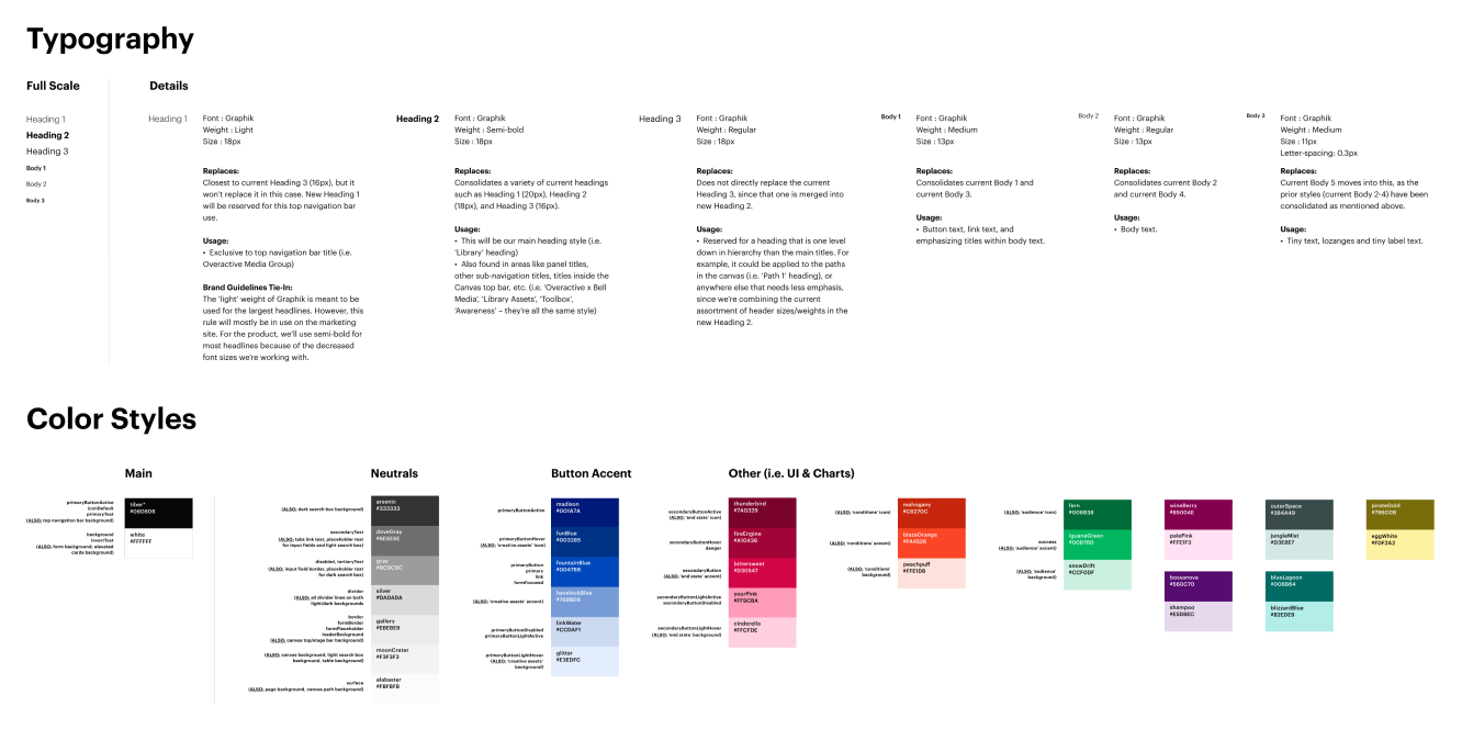
With a clear understanding of the solution that we wanted to build, I iterated designs to address the Campaign Manager's needs, and I created final designs leveraging the platform’s design system.
Using Figma, I created interactive prototypes to showcase a walkthrough during the weekly critique and product demo meetings with the Engineering team and our stakeholders.
I conducted additional usability testing with our new designs, which showed an increase in findability, ease of use and flexibility of our prototype compared to the previous round of testing.
Audience Library Page
Journey Canvas Page
The Outcome
Our product reviews were positive, and customer-satisfaction survey scores have increased. We noticed an increase in the usage of Persona and Dynamic audiences, a decrease in the number of interactions and time spent setting up campaigns, and a decrease in customer support tickets created for audience configuration.
Reflections
I'm proud to be part of such a large-scale project from the very beginning. Thanks a lot to my team for trusting and supporting me throughout the process. If I had more time, I would have continued to gather user feedback and make further improvements.
As requirements often change during a project, I realized the importance of working in low fidelity until the requirements are secured and engineering agrees on the direction. I learned that it is important to get the workflows right before starting on high-fidelity designs and that quick prototyping flows will save us time in the long run.
