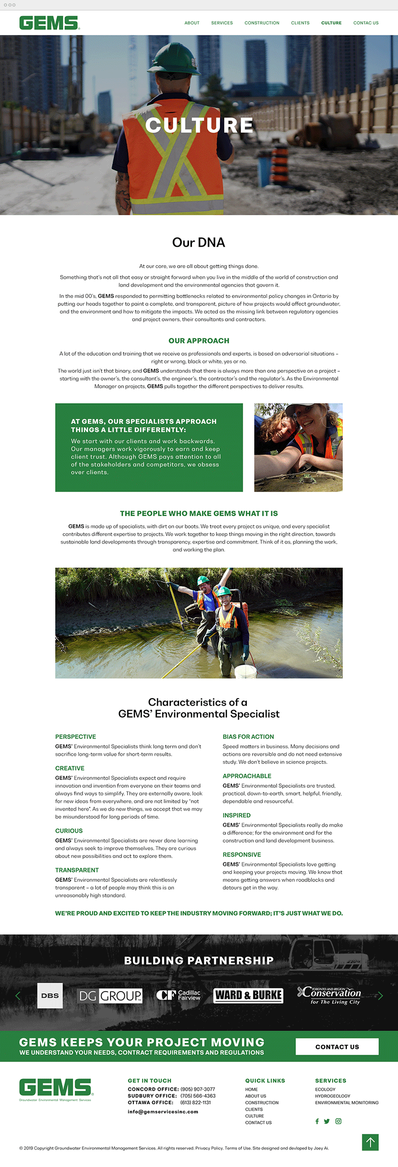
The Process
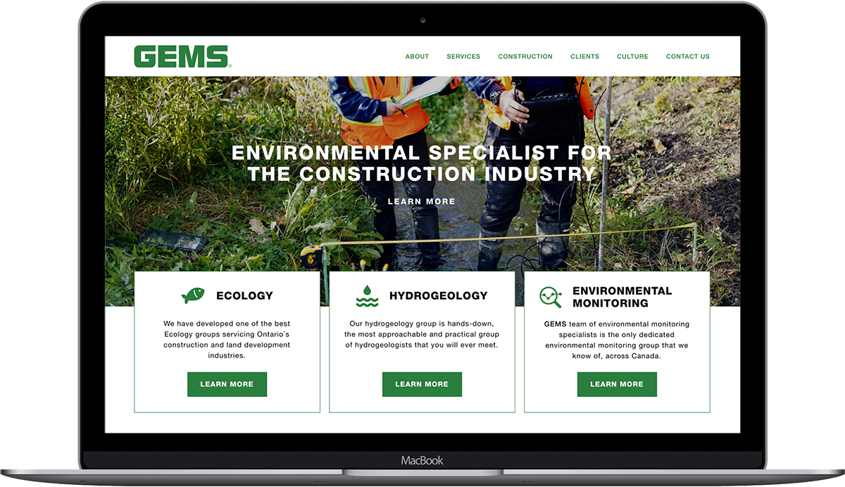
Created from the ground up, I was responsible for the art direction and the design of the website. To start the project, we brainstormed about the functionality and goals of the website and to understand users needs. We wanted to help their customers, partners and others in the industry expand their knowledge on pertinent topics such as contract permits requirements and environmental regulations for the construction and land development business.
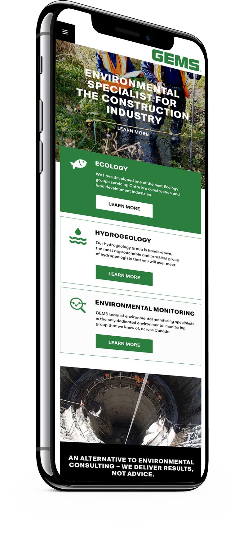
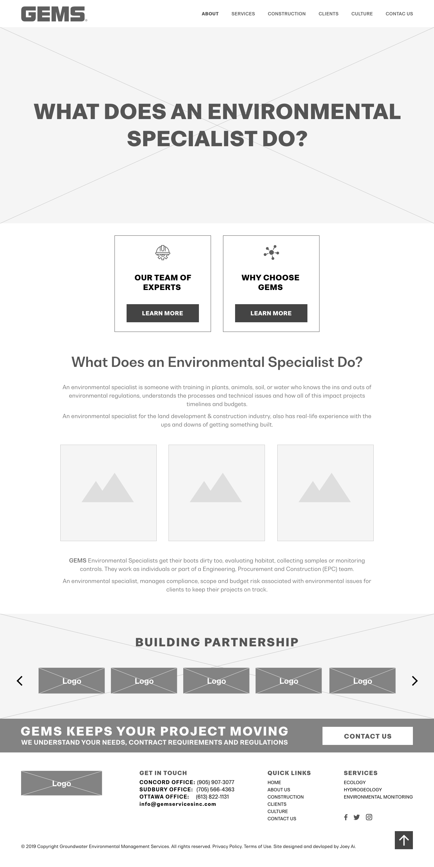
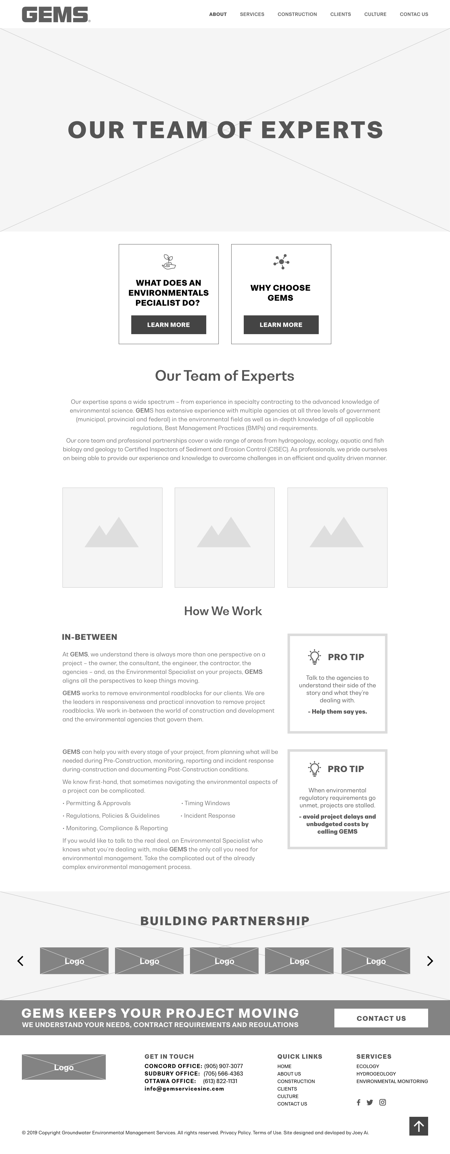
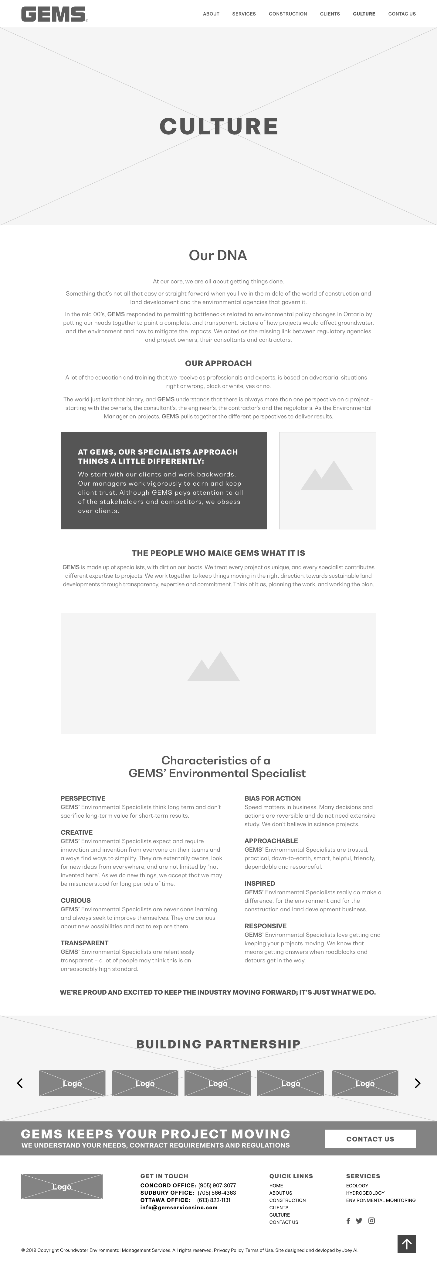
The approach was to create a simple and intuitive responsive interface that was easily accessible and engaging, using a minimalistic, simple, and aesthetic design style. Working closely with the copywriter and the developer, I designed the architecture concept and created the wireframes for each screen, keeping mobile and tablet users in mind.
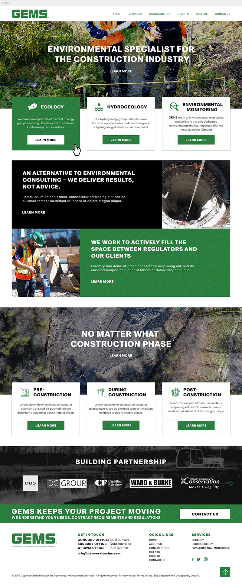
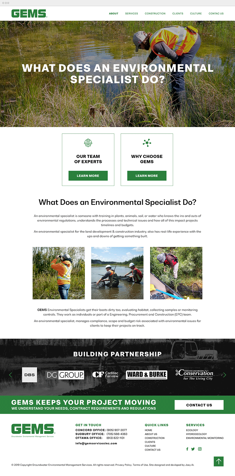
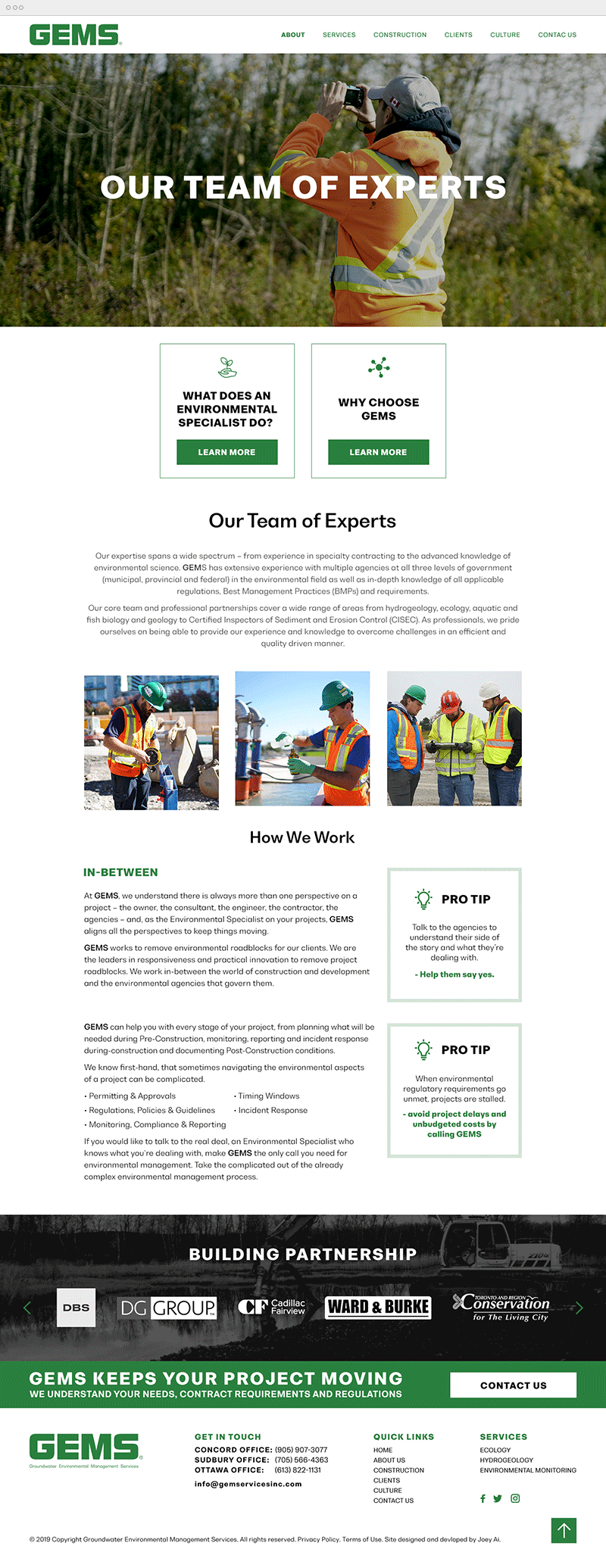
The client provided us with a large collection of photos of their staff working in the field, and requested that we incorporated them throughout the website. To prevent overwhelming the user, I colour corrected the photos by considerably reducing the saturation values, I kept the website's colour scheme minimal to green (the brand colour) and black, and by using plenty of white space. For better engagement with the users, I wanted to make the content more marketable and engaging using visual elements (images, relevant icons, card style for displaying content) in a simplified design of easily accessible information. Using colour blocking, I sectioned the layout into smaller bites of easily digestible content, and spaced out the elements.
The footer design is straightforward in a functional, simple, and organized way and uses few sections to convey more information. To increase the visitor retention rate, I wanted the footer to emphasize the core information of the essential message of the entire website. I carefully chose the colour contrasts, font size, and structure to make sure the footer blended well with the overall website design. I provided a “back to top” button to allow the users navigate the site easily even when they are near the end of the page.
To make the website look more professional and trustworthy, I wanted to display the company's personality, mission and values with maximum impact, especially by leading with the line “Building Relationships”. For the first section, I used a big background image of one of their projects, and inserted a carousel gallery of their clients logos, to add an element of personalization and trust.
For the next section I created a banner with concise white text on a green background to draws the users’ attention, and I included a large CTA button. It displays the brand’s personality and mission with well-written copy: “GEMS keeps your project moving. We understand your needs, contract requirements and regulations."
At the bottom, I displayed the logo for branding, contact information to help visitors get in touch, quick links to encourage visitors to explore the site further, social icons and the copyright, privacy policy and terms of use link.
