Role
UX Researcher, Usability Evaluator, Product Designer
Project Type
Academic Collaboration (Oct-Dec 2020)
Constraints
1 Week Timeline
Tools
Figma, Sketch, InVision, Photoshop
Project Details
I completed this Case Study as part of a team comprising of two other designers. Our design challenge was to identify and select an existing digital product that was lacking in usability and required improvement, analyze its user experience and overall usability by conducting a heuristic evaluation. YesStyle is one of the fastest growing Asian beauty, fashion & lifestyle e-commerce businesses and their app has a total of over 2 million downloads worldwide. We decided to select the YesStyle app because despite its high ratings on the app store, we were surprised to find many usability issues.
We used Jakob Nielsen's 10 general principles for interaction design to determine the heuristics issues, and gave them a severity rating based on Nielson's severity ratings for usability problems.
Evaluated Task
Shop Men’s selection and check out with a product
We evaluated the usability through the eyes of a user trying to purchase an item in the men’s category with a rewards code.
The screens were redesigned to improve the user’s experience from browsing and selecting an item in the men’s category to checking out with a rewards code.

Usability Rating
We measured the app’s compliance to the set of usability heuristics. On a scale from 0 to 4, with 0 being no usability problems and 4 being a usability catastrophe, we gave YesStyle an overall average score of 2.9 for the 8 heuristics we uncovered.
Each heuristic is evaluated with 3 factors:
- The frequency of the problem - is it common or rare;
- The impact of the problem when it occurs - is it easy or difficult to overcome;
- The persistence of the problem - is it one-time or repetitive.
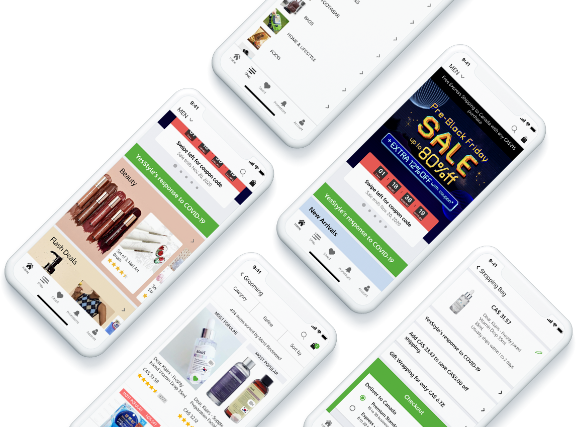
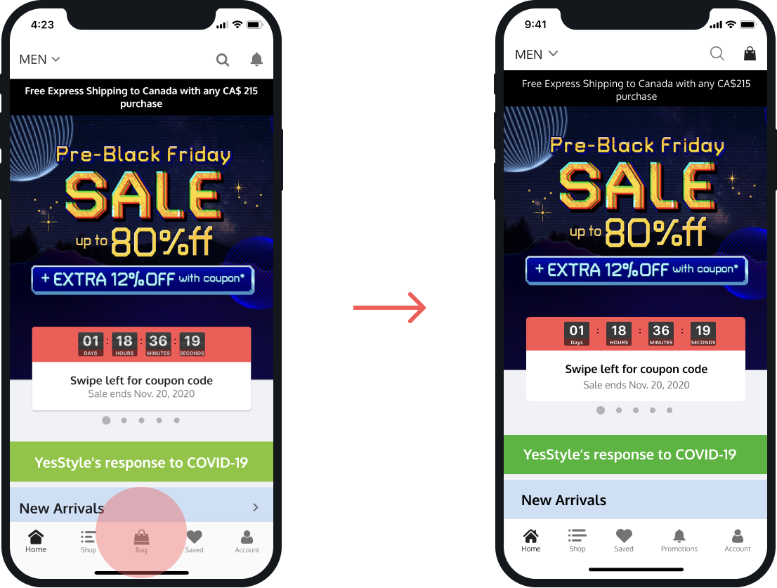
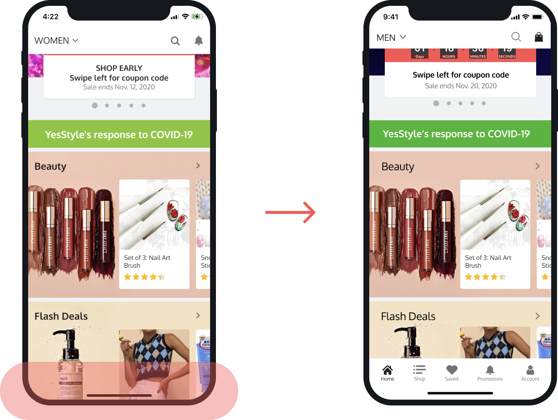
HOME SCREEN
Heuristic: Consistency and Standards
Severity Rating: 2
Issue
With the bag placed on the bottom instead on the conventional top right corner, the user would wonder and spend time looking for it. Based on learned conventions and patterns in app functionality, we expected the shopping bag to be on the top right corner, instead of on the bottom menu tab.
We have identified this as a Consistency and Standards issue and gave it a severity rating of 2 for minor usability problem, because it is easy to overcome once the user knows about it.

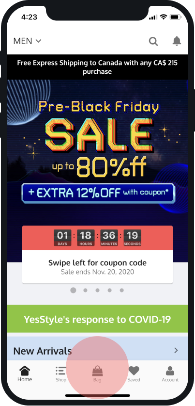
Redesign
Base on learned conventions and patterns in app functionality, we moved the shopping bag to the top right corner, to provide familiarity and spare the user time from wondering. We also moved the bell icon, to the bottom menu tab, and rearranged the order of menu items.
HOME SCREEN
Visibility of System Status
Severity Rating: 1
Issue
On the home screen, the menu tab disappears as the user scrolls down. This is a serious problem since the menu bar is vital for users to navigate through the app. We learned this occurs on all pages whenever scrolling. It can bring confusion and anxiety until the user figures out how to overcome this problem as the user is expecting to have the tab bar available for easy navigation.
We have identified this as a Visibility of System Status and we decided to give this a severity rating of 1 since the user can easily overcome this issue by scrolling up.

Redesign
We believe the disappearance of the navigation tab was a choice made by YesStyle to reveal more image content. On the redesigned system, we are keeping the menu tab visible while scrolling, as the navigation experience is more important for the user.
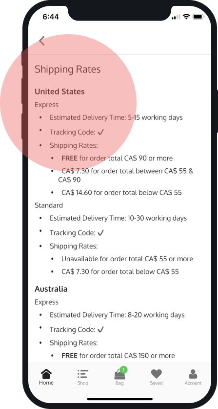
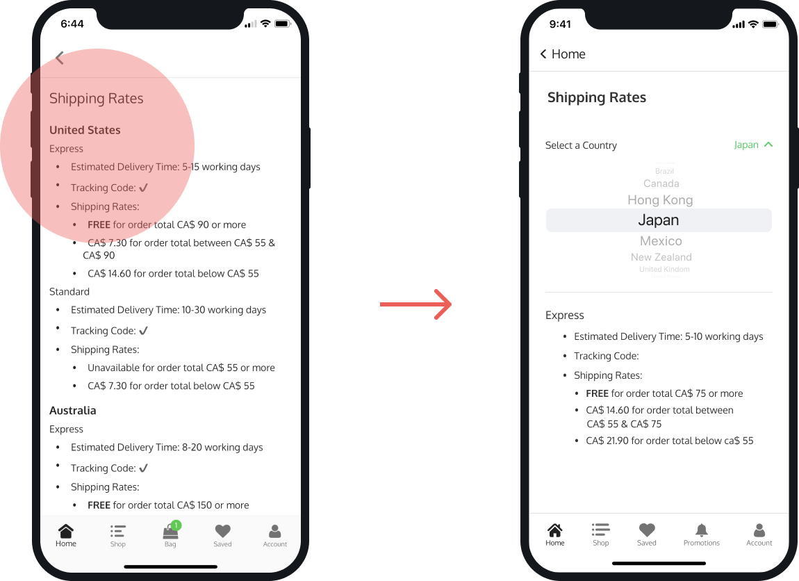
SHIPPING RATES SCREEN
Flexibility and Efficiency of Use
Severity Rating: 2
Issue
On the Shipping Rates screen, the user is overwhelmed with information in the form of a very long list and takes numerous scrolls to locate the shipping rates pertaining to their country.
We have identified this as a Flexibility and Efficiency of Use issue. We gave this issue a severity of 2 for minor usability problem, because it happens only on this page, and it takes many scrolls to locate the needed information. It’s a minor problem, but it may affect the user’s decision making process.
Redesign
We redesigned the screen to incorporate a country picker to help the user easily locate shipping information based on their preferred location. This will reduce the user’s cognitive load and help him get to the checkout faster.
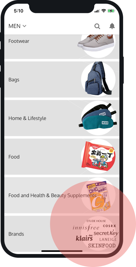
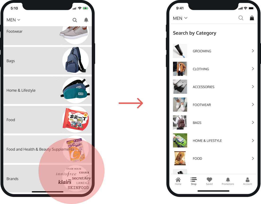
MEN SHOP SCREEN
Aesthetic and Minimalist Design
Severity Rating: 2
Issue
On this screen the user is browsing categories in the men’s shop, and notices that the text and images are overlapping, making the content difficult to read.
We have identified this as an Aesthetic and Minimalist Design issue. Although the problem is easy for the user to overcome, there are many other examples of this same problem in the app. We decided to give this issue a severity of 2 for minor usability problem because it's easy to overcome with more concise design.
Redesign
We improved the design by using concise labels and text formatting, allowing the most relevant and important information to be delivered to the user. To direct the user’s action with a simple yet effective design, we used chevrons which are consistent with the iOS Design Guidelines.
We moved the images closer and to the left of the text in order to make it easier for the user to recognize the content. The user can now process the content with a quick scan which reduces the cognitive load.
GROOMING SCREEN
Visibility of System Status
Severity Rating: 3
Issue
As the user browses best reviewed products on the grooming screen and finds an item that he likes, he taps on the heart icon but there is no feedback to inform the user it has been tapped. The user cannot be sure if he succeeded.
We have identified this as a Visibility of System Status issue. We gave this a severity rating of 3 for major usability problem, since it happens in many instances, and the user does not have the ability to overcome this problem.

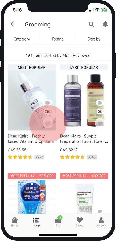
Redesign
We designed the icon to turn green as a response to the user’s action, to provide appropriate feedback and to inform the user of the system status. This would potentially increase sales, allowing returning users to save liked items for later purchases.
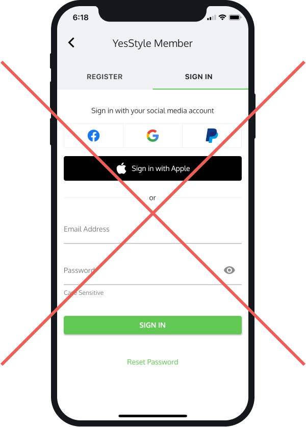
MEMBER SCREEN
Recognition Rather Than Recall
Severity Rating: 3
Issue
On the YesStyle member screen, the user is trying to check out with an item from the shopping bag. The system is not recognizing that the user is already logged in and the user is being asked to fill up account information and sign in again, in order to proceed to checkout. The user is confused at the request to log in while he is logged in already.
We have identified this as a Recognition Rather Than Recall issue. We gave this a severity rating of 3 for major usability issue, since it happens consistently for check out process. It has the potential to be a catastrophic problem if the user has trouble recalling account information.
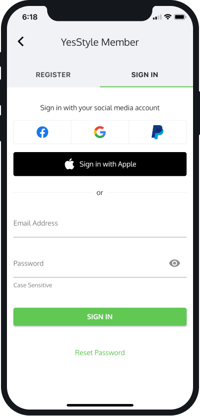
Recommendation
To improve this issue, we’d like to discuss with the developer team about having the system recognize the user is logged in and remembering the user’s information, so that the user does not have to recall account information every time. By removing this step from the flow, the users will have a seamless checkout experience, and will be less likely to abandon shopping.
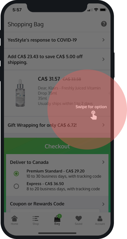
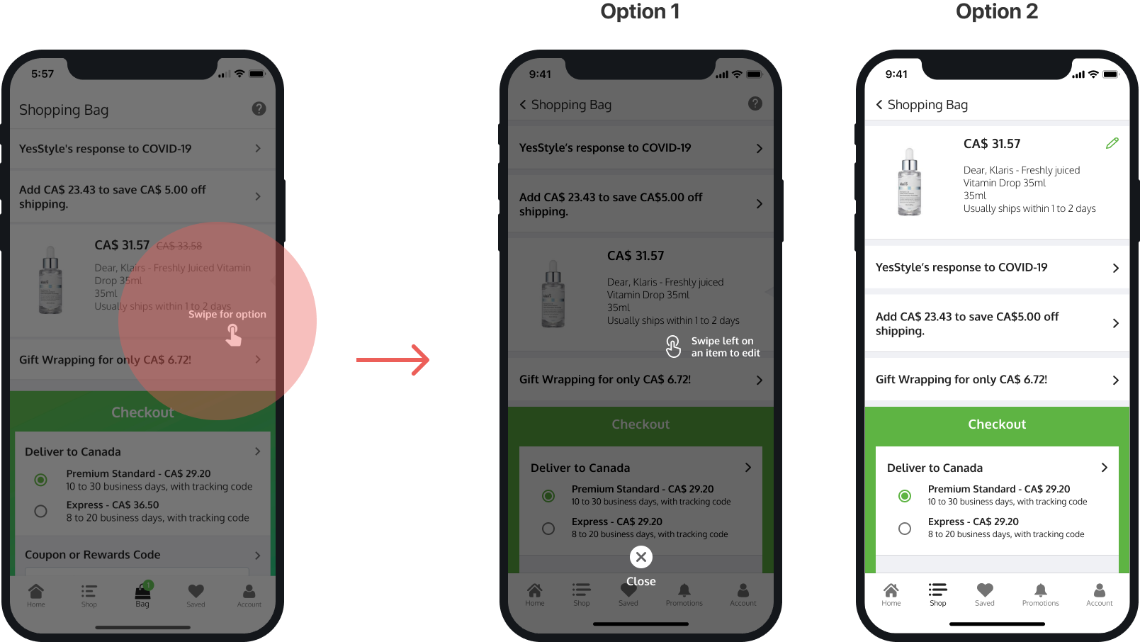
SHOPPING BAG SCREEN
User Control and Freedom
Severity Rating: 4
Issue
On this screen, after tapping on the question mark icon, an overlay screen emerges with the instruction to “swipe for options”. However, the instruction is very unclear and when the user follows the instruction, cannot swipe or close the prompt and the user is left without an exit. The user is forced to quit the app and restart.
We identified this as a User Control and Freedom issue and gave it a severity rating of 4, as a catastrophic usability problem. It has the potential to drive the user to the point of abandoning the app.

Redesign
We proposed two options to solve this problem. Option 1, was to add an exit button and concise wording for instruction - “Swipe left on an item to edit”.
Option 2, was to redesign the item cards, using a simple and intuitive icon, eliminating the need of a help screen. The user clicks on the pen icon and will see options for deleting, adding or removing items. We conducted usability testing with a selected group of users to decide on the option to proceed with. Option 2 was the preferred solution.
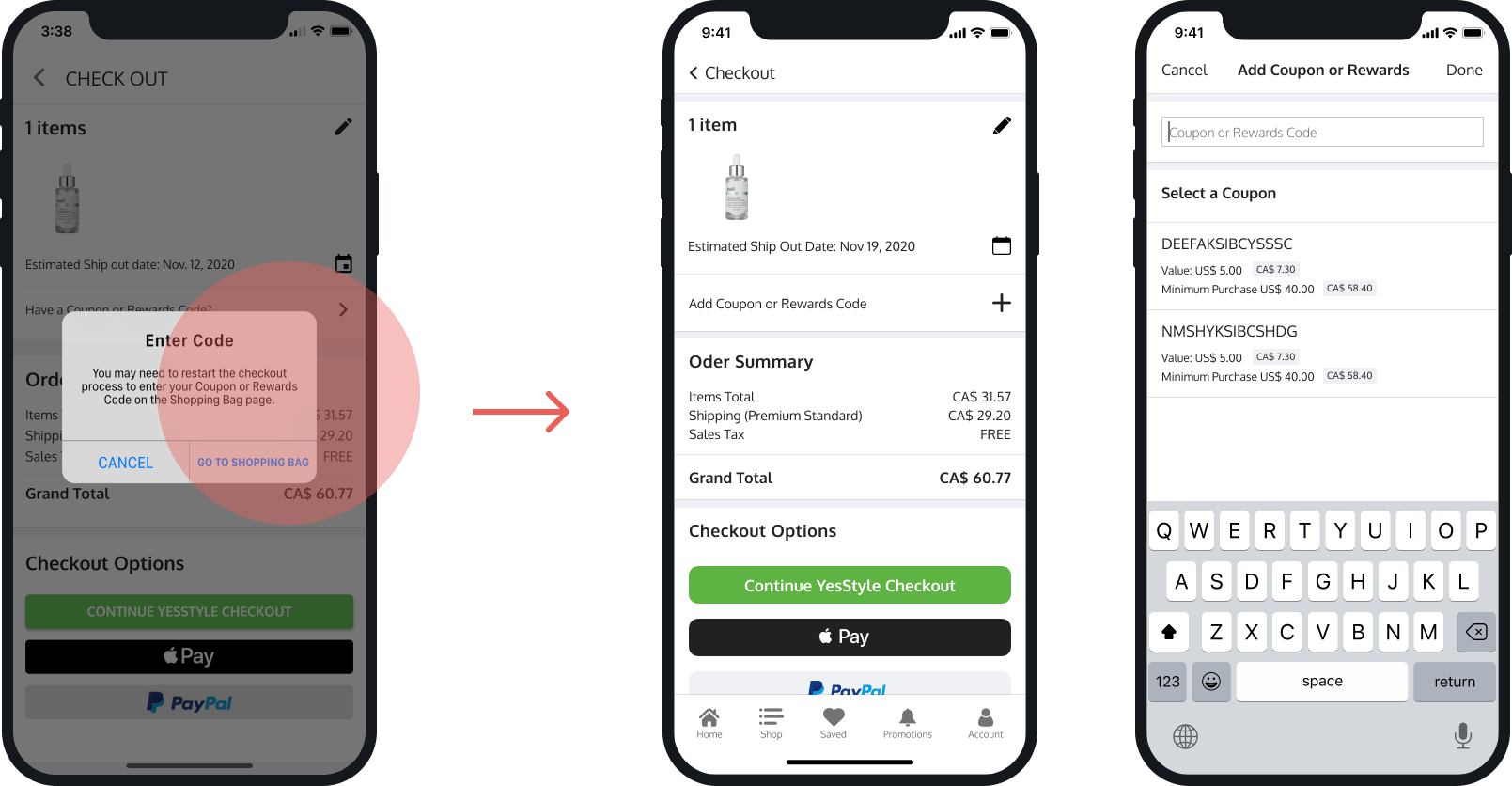
CHECK OUT SCREEN
Error Prevention
Severity Rating: 3
Issue
In the process of checking out, when the user taps on "Have a Coupon or Rewards Code?", the user is met with an “Enter Code” pop up and an instruction to restart the checkout process by returning to the shopping bag screen, where he can enter the Coupon or Rewards Code.
We identified this as an Error Prevention issue and we gave it a severity rating of 3, a major usability problem because it happens frequently and wastes the user’s time. The user can eventually overcome this problem but is a frustrating experience. This should have been prevented from occuring in the first place.
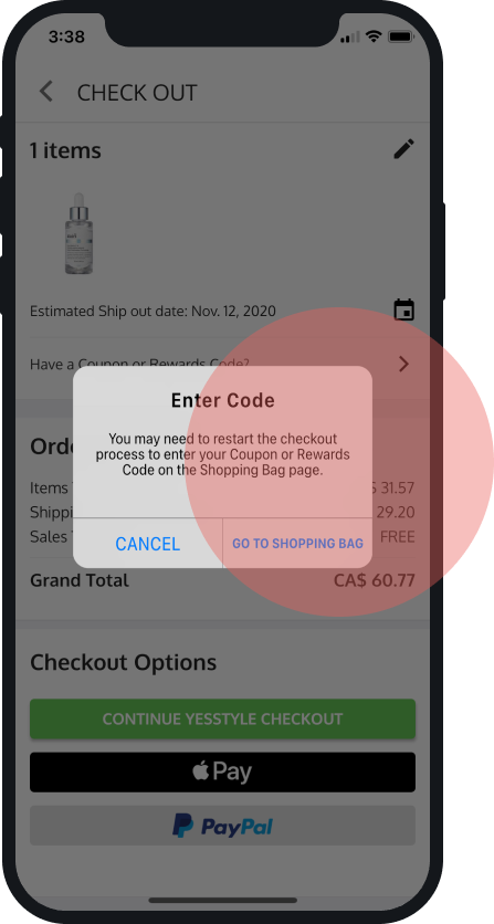
Redesign
In order to prevent this error state, which makes the user restart the checkout process, we recommend removing this option or allowing the user to perform this task at checkout. We simplified the task flow by adding "Add Coupon Rewards Code" that will take the users to a screen where they can enter or select a Coupon or Rewards Code.
Project Outcome
My team’s analysis of YesStyle revealed 8 violations that impacted the usability of the app.
The overall heuristics evaluation score of 2.9 boarders the scale of a major usability problem, and our recommendation was to fix these issues in order to improve the task flow and current user experience on YesStyle. Our recommendations also included the re-designs of the user interface and creation of an accompanying UI library.

UI Library
The last part of the project involved creating a clear and functional organized library of all user interface elements within our design file.
